
Introduction – Why Backgrounds Matter in Indoor Portrait Photography
When you’re new to portrait photography, it’s easy to give all your attention to the subject — their pose, expression, lighting, and whether everything looks sharp. But indoors, the background plays a far bigger role than many beginners realise. A clean, well-chosen background isn’t just a backdrop; it shapes the mood, professionalism, and overall impact of your portrait.
Indoor settings come with their own challenges: limited space, clutter, uneven walls, awkward colours, and shadows that creep in where you least want them. The good news is that creating stunning indoor portraits doesn’t require a large studio or expensive kit. With a few simple background techniques — and a basic understanding of different background types — you can dramatically improve your portraits straight away.
In this guide, we’ll explore six easy, beginner-friendly indoor portrait background techniques that will help you control and enhance your backgrounds, whether you’re working in a small room, a home studio, or a multipurpose indoor space. We’ll also look at the most useful background options available, from pop-up collapsible panels to seamless paper and vinyl, so you can choose the right tools for the kind of portraits you want to create.
By the end, you’ll have a clear, practical approach to managing indoor backgrounds with confidence — and your portraits will look noticeably more polished as a result. The indoor portrait background techniques covered here will elevate your photography skills significantly.
- Introduction – Why Backgrounds Matter in Indoor Portrait Photography
- Technique 1 – Create Distance Between Your Subject and the Background
- Technique 2 — Use Clean, Simple Backgrounds for Professional Results
- Background Types Every Indoor Portrait Photographer Should Know
- Technique 3 – Control Background Light to Avoid Shadows and Harsh Patches
- Technique 4 – Choose Background Colours That Complement Skin Tones and Clothing
- Technique 5 – Change Your Angle to Find a Cleaner, Better Background
- Technique 6 – Add Subtle Texture Without Overcrowding the Frame
- Common Indoor Background Mistakes Beginners Make
- Practical Exercises to Improve Your Indoor Background Skills
- Closing Thoughts
Technique 1 – Create Distance Between Your Subject and the Background
One of the simplest indoor portrait background techniques is to increase the space between your subject and the background. Beginners often place their subject directly against a wall because it feels convenient, but this almost always creates problems: harsh shadows, uneven lighting, distracting textures, or a background that competes for attention.
By pulling your subject even one metre away from the background, several good things happen at once:
1. Shadows disappear or soften
When your subject is too close to the wall, your key light throws harsh, unwanted shadows behind them. Increasing the distance reduces or eliminates those shadows entirely, helping the background look cleaner and more controlled.
2. The background becomes softer and more flattering
Even if you’re shooting with an entry-level lens, a little distance allows the background to fall slightly out of focus. This creates separation and makes your subject stand out more clearly against the backdrop.
3. Colours and textures become less distracting
A textured wall, patterned curtain or decorative feature can dominate a portrait when the subject is pressed right against it. Moving the subject forward instantly reduces the visual weight of the background. Moving the subject forward also softens the look of studio portrait backgrounds, reducing the visibility of patterns, marks or textures that might otherwise draw attention
4. The light on your subject becomes easier to control
With space behind the subject, your key light has room to “fall off” naturally. This creates softer, more pleasing lighting on the face — and makes the background less affected by light spill.
Beginner Tip:
If you’re working in a small room, even 50–80 cm can make a noticeable difference. Don’t worry if you can’t create a lot of depth because any improvement helps.
This simple adjustment also helps beginners understand how to choose portrait backgrounds that feel cleaner and less distracting.
Try This Exercise:
Photograph your subject in the same spot three times:
- touching the wall
- 50 cm away
- 1–2 metres away
When you have done this, compare the results — the difference will surprise you.
This is one of the most effective indoor portrait photography tips for beginners, because increasing distance improves the background and the lighting at the same time.
If you’re looking to improve indoor portraits without investing in new equipment, increasing subject-to-background distance is one of the easiest and most effective changes you can make.
Technique 2 — Use Clean, Simple Backgrounds for Professional Results
One of the most effective indoor portrait background techniques for beginners is choosing clean, simple backgrounds. Busy or cluttered walls can instantly distract from your subject, especially in small indoor spaces where depth is limited. A plain backdrop helps the viewer focus on the person — not the room.
If you’re working at home or in a small studio, start by looking for the cleanest area you have. A smooth wall, a piece of seamless paper, or a neutral-coloured cloth all work beautifully. These options also give you consistent studio portrait backgrounds, which beginners often find easier to control.
When thinking about how to choose portrait backgrounds, aim for colours and textures that complement skin tones and clothing rather than compete with them. Soft greys, creams, and muted colours are ideal for most indoor setups because they photograph well and keep the portrait looking polished.
Simple backgrounds are one of the quickest ways to improve indoor portraits because they eliminate the visual noise that makes an image feel amateur. With a clean backdrop in place, your lighting, composition, and subject immediately stand out — creating a more professional result even before editing.
If you’re unsure where to start, remember this:
When in doubt, simplify. Beginner photographers often underestimate just how powerful a minimalist background can be in transforming an indoor portrait.
Background Types Every Indoor Portrait Photographer Should Know
Before diving deeper into specific indoor portrait background techniques, it helps to understand the different types of backgrounds available. Indoors, your backdrop has a huge influence on the overall style and professionalism of a portrait. The good news is that you don’t need a full studio to create clean, consistent results — there are several beginner-friendly options that work beautifully in small spaces.
Choosing the right background type is an essential part of how to choose portrait backgrounds, and it’s one of the most practical indoor portrait photography tips you can learn early on.
Below are the most useful background types for beginners.
Pop-Up Collapsible Backgrounds
These are ideal for photographers working in tight indoor spaces. They are also ideal for photographers who travel to client’s homes. They fold down small, set up in seconds, and often come with two colours or textures (e.g., grey/white, black/stone, concrete/blue).
Why they’re useful:
- Portable and lightweight
- Wrinkle-free
- Great for headshots or half-body portraits
- Easy to control with simple lighting
Collapsible backgrounds are one of the easiest ways to improve indoor portraits when space is limited or you need something that is portable when you travel to a client’s location.
Seamless Paper Rolls
Seamless paper is the classic studio backdrop and works brilliantly for clean, modern portraits.
Benefits:
- Smooth, consistent, and wrinkle-free
- Available in dozens of colours
- Perfect for controlled studio portrait backgrounds
- Easy to light evenly

Solid seamless backgrounds give a polished studio look that
works beautifully for full-body portraits
Beginners should start with neutral tones like white, grey, or beige — they flatter most subjects and are forgiving under different lighting conditions.
I recommend starting with a mid-grey seamless paper background as your very first choice.
Vinyl Backgrounds
Vinyl is a durable option that lasts far longer than paper and can be wiped clean. It’s especially useful for full-length portraits where the backdrop continues under the subject’s feet.
Advantages:
- Hard-wearing and long-lasting
- Resistant to marks and footprints
- Available in solid colours and printed textures
Vinyl can give portraits a polished, professional studio feel without constant replacing.
Fabric Backgrounds (Muslin, Canvas, or Textured Cloth)
Fabric backdrops create a softer, more artistic look compared to paper or vinyl. They’re lightweight and easy to transport.
Why beginners like them:
- Affordable and versatile
- Offer gentle texture without overwhelming the portrait
- Suitable for classic portraits and characterful indoor setups
Note that fabric wrinkles easily, so use clamps or a quick steam before shooting.
A Simple Neutral Wall
Don’t underestimate it — a clean, uncluttered wall can be an excellent choice, especially for beginners.
Ideal colours:
Soft grey, off-white, muted earth tones, pale blue.
Why it works:
- No setup required
- Natural, believable environment
- Easy to control with basic lighting
A neutral wall can produce surprisingly professional results when combined with the right lighting and subject distance.
How to Choose the Right Background
When deciding which background to use:
- Consider the portrait purpose (headshot, family, branding, creative).
- Match the colour and texture to the subject’s clothing and skin tone.
- Think about how much space you have and how the background interacts with your lighting setup.
- Keep it simple — especially when learning.
Understanding these background types will make the next indoor portrait background techniques even easier to apply, giving you more control over style, lighting, and mood.
Here are my suggested background types for some different use cases:
Headshots: collapsible pop-up, seamless paper, or a neutral studio wall
Half-body portraits: seamless paper or collapsible pop up
Full-length portraits: vinyl or seamless paper
Creative/editorial: textured fabric or printed vinyl
At client’s home: Collapsible pop-up
Technique 3 – Control Background Light to Avoid Shadows and Harsh Patches
Light has a huge influence on how your background appears, especially indoors. Beginners tend to focus on lighting the subject and forget that poorly controlled background light can ruin an otherwise good portrait. Unwanted shadows, bright hotspots, uneven tones, or colour shifts are all common problems in indoor setups — but they’re easy to fix once you understand a few essential indoor portrait background techniques.
Here are some practical indoor portrait photography tips that will help you keep your backgrounds clean and consistent:
1. Move your subject away from the background
You’ve already seen how distance affects blur and separation, but it also prevents harsh shadows from falling directly onto the wall or backdrop. Even 50cm of extra space can make a dramatic difference in reducing shadows, especially when using studio portrait backgrounds like seamless paper or collapsible panels.
2. Feather your key light for a softer fall-off
Instead of aiming your light directly at your subject, turn it slightly past them. This “feathering” technique ensures your light wraps softly around the face while keeping the background from being blasted with bright, uneven spill. It’s one of the simplest ways to improve indoor portraits without extra equipment.

A fully controlled black background eliminates ambient distractions and adds dramatic focus
3. Use light-shaping tools to control spill
Grids, barn doors, and flags give you more precise control over where the light falls. These tools help you avoid creating bright patches or unwanted gradients on the background. They’re especially useful when you’re experimenting with different portrait background ideas or working in a multipurpose indoor space.
4. Introduce a background light—intentionally
A subtle background light can add depth, separate the subject, and lift darker tones, but the key word here is intentional. A soft, controlled glow works well; an uncontrolled blast of light does not. This is where learning how to choose portrait backgrounds and how they respond to light really pays off. You can even add a coloured gel to your background light for added creativity.

A bright white background emphasises clean, modern styling and
keeps all focus on the subjects
5. Balance subject light and background light
Indoor spaces often have mixed lighting: window light, ceiling lights, practical lamps, or reflections from nearby surfaces. Pay attention to how these interact with your background. Turning off one practical light or repositioning a lamp can instantly stop a distracting bright patch from appearing behind your subject.
My preference is to control the light in the space by using camera settings that produce a black frame (no flash, no picture) before artificial light is added to the scene. My typical camera settings will be a shutter speed of my flash sync speed (1/200 second in the case of my camera), my lowest native ISO (100 in the case of my camera) and an aperture of either f/5.6 or f/8, or whatever it needs to produce a black frame without flash).
This means that the only light in the scene comes from my own artificial light, which I control.
This workflow is one of the most reliable indoor portrait background techniques because it ensures the background only receives the light you intentionally add to it and therefore allows consistency and control.
Beginner Tip:
Always take a test shot of just the background before your subject steps in.
If it looks blotchy, uneven, or too bright, adjust your lighting before continuing. This simple habit saves a lot of frustration and instantly helps you improve indoor portraits.

A controlled background light creates gentle separation
without overpowering the scene
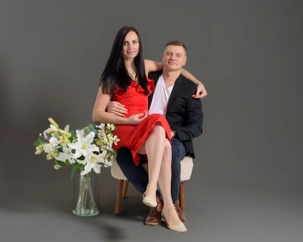
Technique 4 – Choose Background Colours That Complement Skin Tones and Clothing
One of the easiest indoor portrait background techniques to elevate your images is choosing background colours that work with your subject rather than against them. The right colour instantly creates harmony, directs attention to the face, and gives your portraits a cleaner, more professional feel. The wrong colour, however — even if it’s a favourite shade — can cause colour casts, reduce contrast, or make skin tones look dull.
Why Background Colour Matters Indoors
Indoor settings usually offer more controlled lighting than outdoor portraits, so background colour plays a bigger role in shaping the mood of the image. Different colours reflect different amounts and qualities of light, which means they can subtly shift the overall look of the portrait. Understanding how colours interact with skin tones is one of the most underrated studio portrait background skills a beginner can develop.
Simple Colour Guidelines That Always Work
Here’s a beginner-friendly breakdown that removes the guesswork:
• Neutral backgrounds (grey, black, white)
These are the most versatile options for indoor portraits. Grey is especially popular because it avoids strong reflections and adapts beautifully to different lighting styles. Mid-grey backgrounds are excellent for avoiding colour casts — an easy win for beginners.
• Warm backgrounds (beige, tan, warm grey)
Gentle warm tones flatter most complexions and suit lifestyle-style portraits, headshots, or children’s photography. They create a soft, welcoming atmosphere without overwhelming the subject.
• Cool backgrounds (navy, charcoal, deep teal)
Darker cool tones are fantastic for creating drama and separating the subject from the background. They also make skin tones appear more luminous because cool colours recede visually, helping the subject pop forward.
• Avoid strong saturated colours unless intentional
Bright reds, greens, and yellows reflect colour onto skin — often unpredictably. Beginners can certainly use bold backgrounds, but it’s best done deliberately once you understand how light and colour interact.
Beginner Tip:
If you’re unsure which colour to choose, start with mid-grey.
It’s the most forgiving option, works in tight indoor spaces, and remains the industry workhorse for studio portrait backgrounds.

The soft blue background complements the subject’s jacket, creating a harmonious colour palette for a clean indoor portrait
Technique 5 – Change Your Angle to Find a Cleaner, Better Background
One of the most overlooked indoor portrait background techniques is simply changing your shooting angle. When you’re indoors, it’s common to feel limited by the space — small rooms, clutter, furniture, awkward walls — but a tiny shift in position can completely transform the background and give your portraits a more polished, professional look.
Beginner photographers often focus solely on the subject and forget to scan the edges of the frame. This is how radiators, picture frames, lampshades, or bright patches of wall sneak into the shot. By adjusting your angle just a few degrees, you can turn a distracting scene into a clean, studio-quality portrait.
Small Movements Make a Big Difference
Try these simple adjustments:
• Move left or right slightly
You’ll often find that shifting just a foot can hide clutter, simplify wall space, or reveal a more flattering colour tone.
• Change your camera height
Shooting a little higher or lower can eliminate distracting objects behind the subject or create a more intentional background gradient. However, remember that, for headshots, the best camera height will invariably be at the eye level of your subject, and for full body shots, it will normally be around your subject’s waist height.
• Rotate your subject minimally
Turning them 10–20 degrees towards your key light source or a smoother wall can instantly elevate the entire shot.
Use Angles to Control Indoor Background Problems
When you’re working in tight indoor spaces, backgrounds often contain:
- bright or uneven patches of light
- awkward shadows
- furniture you can’t move
- distracting wall decor
Changing your angle is a fast, reliable way to avoid these pitfalls without needing extra equipment.
This also ties in beautifully with studio portrait backgrounds because angles help you make the most of whatever backdrop material you’re using — seamless paper, pop-up panels, or textured vinyl.
Beginner Tip:
Before you take the shot, do a slow “background sweep” with your eyes.
Move your head left and right while looking only at what’s behind the subject. You’ll spot issues long before they ruin a portrait.
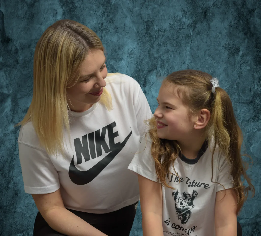
A neutral grey backdrop works well when you want props or wardrobe to add the personality
Technique 6 – Add Subtle Texture Without Overcrowding the Frame
Once you’re comfortable with clean, simple backgrounds, the next step is to introduce subtle texture to give your indoor portraits more depth and character. This is one of those indoor portrait background techniques that can take your images from “perfectly fine” to “visually interesting” – as long as you keep it controlled.
The key word here is subtle. Texture should support the portrait, not fight with the subject for attention.
Use Texture to Add Depth, Not Distraction
Texture works best when it:
- gently breaks up large flat areas
- adds a bit of visual interest behind the subject
- creates a sense of depth and dimensionality
A lightly textured background adds depth without distracting from the subject
Good examples for studio portrait backgrounds include:
- mottled grey or charcoal backdrops
- softly painted canvas
- lightly textured fabric or muslin
- vinyl with a gentle plaster or stone effect
All of these give the background some life without shouting “look at me”.
Balance Texture with Clothing and Expression
A textured background can look fantastic – unless the subject is already wearing bold patterns or strong colours. Then it can all get a bit much.
A few simple rules:
- If the subject’s clothing is busy, keep the background smoother.
- If the background has visible texture, suggest simpler clothing.
- For serious or calm expressions, softer textures usually work better than harsh, high-contrast ones.
This is a very practical part of how to choose portrait backgrounds – you’re always thinking about how subject and background work together, not separately.
Let Light Shape the Texture
Texture really comes alive when it’s lit well.
With directional light, a lightly textured background can show gentle gradients and tonal shifts that look very polished. With flat, frontal light, the same texture can look dull or patchy.
As part of your indoor portrait photography tips toolkit, try:
- moving your key light slightly to the side to create a soft gradient across the background
- using a separate, low-power background light to lift texture very gently
- checking the histogram and your preview to avoid hot spots that make the texture look blotchy

Soft gradient lighting on the background adds depth and dimensionality to headshots
Adding Texture in Post-Production
You don’t always have the perfect backdrop to hand, and that’s where post-production can help.
In Lightroom or Photoshop, you can:
- darken or smooth backgrounds to reduce distracting texture
- subtly add texture using overlays or gradient maps
- blend in a digital textured backdrop when the original wall or sheet looks too plain
This should be done with a light touch – the goal is to improve indoor portraits, not make them look obviously edited. Start with very low opacity and build up slowly. If you can clearly see the effect at a glance, it’s probably too strong.
Beginner Tip:
If you’re unsure how much texture to use, start with a mottled mid-grey backdrop and simple, directional lighting. It’s one of the safest, most forgiving studio portrait backgrounds, and it gives you plenty of room to experiment with both real and post-production texture without overpowering the subject.
Common Indoor Background Mistakes Beginners Make
Even with the best intentions, it’s easy for beginners to overlook background issues when working indoors. Small rooms, mixed lighting and everyday household items can introduce distractions that pull attention away from the subject. The good news is that most of these problems are simple to fix once you know what to look for — and becoming aware of them is an essential part of learning effective indoor portrait background techniques.
Here are the most common mistakes and how to avoid them:
1. Placing your subject too close to the wall
This almost guarantees harsh shadows, exaggerated texture and a flat-looking portrait. Even moving the subject 50 cm to 1 metre forward can dramatically improve separation and lighting.
Fix: Create distance and use a wider aperture to soften the background.
2. Not noticing clutter creeping into the frame
Indoors, things like shelves, picture frames, light switches, radiators and stray objects can easily appear behind the subject. Beginners often don’t spot them until after the shoot.
Fix: Do a slow “background sweep” with your eyes before shooting — a key part of how to choose portrait backgrounds in small spaces.
3. Busy wallpaper or patterned backdrops
Unless used very intentionally, strong patterns can overpower the portrait and create visual chaos.
Fix: Switch to a neutral wall, seamless paper or a simple studio portrait background that doesn’t compete with the subject.
4. Mixed lighting causing colour patches on the background
Indoor spaces often include natural light, ceiling lights and lamps — all with different colour temperatures. These can create uneven tones or unwanted colour casts on the background.
Fix: Turn off competing light sources and control the environment using the “black frame test” before adding your artificial light.
5. Bright hotspots or patchy shadows behind the subject
This is one of the most common issues in indoor setups. A poorly angled key light can create uneven bright patches, or shadows that make the background look messy and unprofessional.
Fix: Feather your light, add distance, or use flags/grids to shape the spill — simple but powerful indoor portrait photography tips.
Beginner Tip:
If something in the background draws your eye when you review the image, it will draw the viewer’s eye too. Always correct distractions before taking the final shot — it saves time and leads to far more professional results.
Practical Exercises to Improve Your Indoor Background Skills
The best way to master these indoor portrait background techniques is to put them into practice. These simple exercises are designed to help beginners build confidence, train their eye and gain hands-on experience in controlling backgrounds indoors. You can do them at home, in a small studio or in any indoor space with enough room for a subject and a light.
Each exercise reinforces the skills you’ve learned in this guide and helps you apply them in real portrait situations.
1. The Background Sweep Exercise
Goal: Train yourself to notice distractions before you take the shot.
Stand your subject (or a mannequin, or even a coat on a hanger) in front of your chosen background. Before lifting your camera, slowly scan behind the subject from left to right, checking for clutter, bright objects, lamp shades, picture frames or messy areas you might miss when concentrating on the subject’s face.
Take a shot, review it, and see what you overlooked. Repeat until the background is clean.
This simple habit is one of the most effective indoor portrait photography tips you can learn as a beginner.
2. The Distance & Separation Test
Goal: See how subject-to-background distance affects blur and shadows.
Photograph the same subject at different distances from the background:
- 25 cm
- 50cm
- 1 metre
- 1.5 metres
Use the same lens and aperture throughout.
As you compare the results, you’ll notice that shadows disappear, background texture softens and your portraits immediately look more polished. This exercise is a brilliant way to improve indoor portraits without changing your lighting setup.
3. The Black Frame Lighting Control Exercise
Goal: Gain total control over indoor lighting before introducing your artificial light.
Set your camera to ISO 100, shutter 1/200 and an aperture around f/5.6 or f/8. Take a test shot. If the image isn’t completely black, adjust your settings until it is.
Only then should you begin adding artificial light.
This workflow is key to creating clean, consistent studio portrait backgrounds because you eliminate stray ambient light before shaping your scene.
4. The Feathering Challenge
Goal: Learn how light direction affects the background.
Photograph the subject three times:
1. With the key light aimed directly at the subject
2. With the key light slightly feathered past the subject
3. With the key light fully feathered away from both subject and background
Examine how each setup changes shadows, hotspots and overall background smoothness. This is a great way to learn how small lighting adjustments can dramatically improve indoor portraits.
5. The Angle Shift Exercise
Goal: Understand how minor movements help you find a cleaner, better background.
Take the same portrait, but alter your shooting position:
- step 30 cm left
- step 30 cm right
- crouch slightly lower
- raise your camera a little higher
This exercise teaches you how different angles reveal or hide unwanted elements. It’s an essential skill if you’re working in a small indoor space and want to create more professional-looking portraits using simple portrait background ideas.
6. The Colour Experiment
Goal: See how background colours influence skin tones, contrast and mood.
Photograph your subject against:
- mid-grey
- warm beige or tan
- deep navy or charcoal
- white
Keep lighting and camera settings consistent.
This is a powerful way to learn how to choose portrait backgrounds that flatter your subject and match the atmosphere you’re trying to create.
7. The Texture Subtlety Test
Goal: Learn how much texture is “just enough”.
Create a series of portraits using:
- a plain wall
- a softly textured backdrop (muslin, mottled grey, etc.)
- a stronger textured surface (fabric folds or vinyl print)
- subtle texture added in post-production
- heavy texture added in post-production
Compare all five versions side-by-side. You’ll quickly see how easily texture can overpower a portrait — and how subtlety works best. This directly builds confidence in using indoor portrait background techniques without overwhelming the frame.
8. The Lighting Gradient Exercise
Goal: Create professional-looking gradients on a simple indoor background.
Stand your subject in front of a plain wall and experiment with:
- raising and lowering your key light
- moving it closer or farther away from your subject
- shifting it slightly to the left or right
You’ll see gradients forming naturally — darker on one side, lighter on the other — giving your portraits a more polished, studio-like feel.
Beginner Tip:
Don’t rush through these exercises. The goal is not just to complete them, but to see how each change affects the final portrait. The more you experiment, the more instinctive your background control becomes.
Closing Thoughts
Indoor portrait photography can feel challenging at first, especially when you’re working in small spaces or learning how to control backgrounds for the first time. But with a little practice — and a good understanding of these indoor portrait background techniques — your images will start to look cleaner, more intentional and far more professional.
The more you experiment, the more your confidence will grow. Photography is a craft built on curiosity, not perfection, so don’t be afraid to play, adjust and refine as you go.
If you’d like support along the way, I’m always happy to help. Whether you’re looking for guidance on technique, feedback on your portraits or simply someone to walk you through the basics of indoor setups, feel free to get in touch. I do offer one-to-one mentorship for beginner photographers, and we can chat about what that might look like if you’re interested.
You’re also very welcome to reach out if you’re local to North Yorkshire and would like to explore second shooter opportunities — it’s a fantastic way to build confidence, gain real experience and work alongside another photographer in a relaxed, supportive environment.
And if you’d like some visual inspiration, you can explore my galleries to see how these ideas come to life in real shoots:
Weddings Gallery
Families Gallery
Headshots Gallery
Actor & Model Portfolio Gallery
If you have any questions at all, or you simply want to say hello, I’m only a message away.